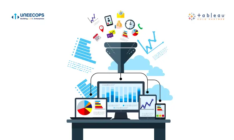


Every single day your business generates data related to sales revenue, customer interactions, stock levels, order process, production metrics, costs, and other KPIs. But, with so much data already available it becomes difficult to mine through insights and see the story the data wants to convey.
Data visualization helps you gain meaningful insights faster. The human brain can connect the dots easily by looking at the visual format, connections and patterns that would otherwise remain out of sight. Further, the traditional method of viewing data such as documents and spreadsheets works no more in a fast-paced world. Visualization adds meaning and makes it simpler for business users to understand vital information, communicate trends, understand the impact of sales strategies, marketing performance and beyond.
Data visualization: Digital imperative for all businesses
It’s hard to think about any industry that doesn’t benefit from data visualization. Whether you are in Pharma, manufacturing, logistics, supply chain or any other industry, the benefits of data visualization are immense and overpowering. Data visualization can:
- Visualize large amounts of complex data easier over spreadsheets or reports
- Help you easily experiment with different scenarios by making slight adjustments
- Identify areas that need attention or improvement
- Clarify which factors influence customer buying patterns
- Help you understand which products to place where
- Get the message across quickly
- Identify outliers and address issues before they surface
See the big picture
Data visualizations allow you to see the big picture and understand important business metrics. Visualization adds a flavor to your stories and empowers you with the knowledge to make the right decisions. You can catch the attention of every business user for a long time. You can spot trends and address any sign of lowered performance. You can examine how your business is performing. What needs to be modified. The ability to understand the significance of your data drives more informed decisions.
Benefit from a different type of visualizations
You can communicate your message effectively with massive and different types of visualizations.
| Highlight Table | Histogram | Heat Map | Box-and-whisker Plots | Streamgraph | Wedge Stack Graph | Area Chart |
|---|---|---|---|---|---|---|
| Word Cloud | Circle View | Scatter Plot (2D or 3D) | Tree Map | Gantt Chart | Bubble Cloud | Cartogram |
So now you can replace your static table and use this interesting visualization and chart types to make a long-lasting impression.
In today’s world gaining actionable insights at the moment is a priority for all decision-makers. Being a CEO, CIO, CXO or business owner, you already know the importance and criticality of making smart decisions. So, it pays to invest in a self-service BI tool that can give you deep insights on the move. Tableau renders advanced visualizations to see your data in the form of stories, impressive layouts, heatmaps, radial trees, bubble clouds and formats.
Within a time, get informed and dive deeper into unforeseen risks, lurking opportunities, profitable zones, or just about anything. Tableau is simplifying the lives of business professionals in interesting ways. Let’s connect and navigate you to the journey of success with data visualization.