


In continuation to our first blog where we have described few things when taken into account could improvise dashboard readability experience and dashboard design. If you have missed it by chance, we recommend you to check our first blog post.
This is the final part of the two-phased blog post where we bring a new set of inputs on key areas to strategies for building user readability and adoption. Carrying diverse experience in the BI industry we foresee a major challenge in the BI adoption practices the first stake is to identify SPOC in your organization to amplify Tableau adoption practices and ensure its scalability, whereas at the same time it brings along added responsibility to design and develop a dashboard in a way which should add lucrative approach of ‘wanting to come back’ to decipher inputs from the Tableau dashboards. This is where an organization can realize its potential to ensure Tableau adaptability with improved user experience and dashboard design practices.
Here we help you justify key inputs to amply better user experience for dashboard design practices. :
1.Last updated date
Often when we create a dashboard we add a lot of insights. For instance, our Sales dashboard may include KPIs like Sales amount, comparative views, Sales trend with different which essentially allows user to dissect the dashboard as per his/ her requirement.
As a Tableau consultant, Uneecops typically drive the approach to collate business requirements from the stakeholders, check feasibility, design blueprint followed by dashboard development and user acceptance testing. These are the very basic steps involved in the dashboard process. It could be certain that we push insightful metrics for the business users which could be very informative and at the same time help assess key decision-making capabilities.
Still, one more point if we address in our dashboard could elaborate the context add more inputs to the business dashboard users which is ‘Last updated date’. This key inclusion would help businesses ascertain when the dashboard was last updated with all the key metrics displayed in the dashboard. It certainly adds more preference as the user is versatile to know the dashboard with which he/she interacts hold data up till what time period, it could be they want to have updated view of the dashboard whereas the dashboard speaks last refresh date was something else.
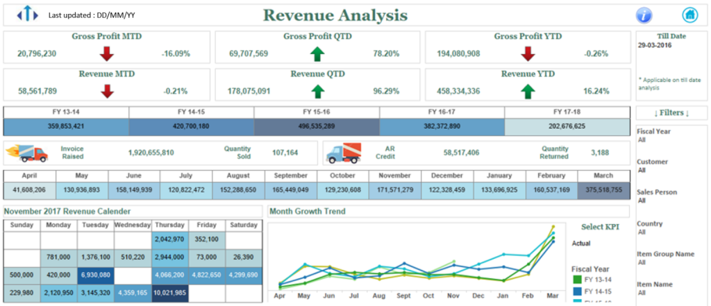
On the dashboard deployment approach, the practice is not only about dashboard creation for end-user consumption it is about providing an additional set of inputs to help them assess a complete view of information display. Notice how in the below sample dashboard snapshot (top left side) we have added ‘Last Updated’ date which further helps user to assess as to what data displayed in the dashboard being tied to data refresh date essentially.
2. A word with business user
‘Not just dashboard deployment’ as an organization we are considerate with our clients where we have the privilege to offer our dashboard implementation services. Our key success metric is not just concerned with driving successful dashboard deployment. As an organization, we have our success metric on the basis of the user adoption which although is a staged process but we always entrust to add inputs to user scalability and driving the adoption practices.
Essentially post the dashboard deployment, on our second input for driving ‘Dashboard experience and user design’ adds to communicate with the business users on the adaptability of the dashboard. A routine fortnight check with the business user on below inputs could help dashboard usage and its justification could bring in a whole perspective on the dashboard adoption, ask questions related to:
- How do you see the user engagement with the dashboards developed?
- What is the daily consumption level of the dashboard?
- Do the users relate to what insights have been captured
- Any new information or improvement which could help more dashboard adoption

These are a few of the points listed but surely not limited to, what matters is to have regular free conduct of information exchange between the consultant and the business dashboard users which aids to improved dashboard adoption practices as well as it’s for the ‘business users’ for whom the dashboard is developed, True ?.
3. Dashboard design
With design tools like Figma, Adobe Illustrator there has been a recent trend on the Modern UI dashboards design. The look and feel of the dashboard is altogether a new rich experience for the user base. It aids to set up a new reach toward the dashboard giving users a rich experience on the look and feel tied with good interactivity.
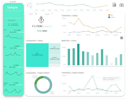
Consider the below dashboard, it’s nothing OTB, used Figma and Tableau to create the sample dashboard. The view of the dashboard also adds to the nature of wanting to come back to collate business insights and that is what should be a perfect mix of output. There are abundant tutorials available on the internet which talk in detail about how to start building your dashboard with Figma or other new design tools, make sure to check them out for a detailed peek.
Make sure to visit content articles available online but to help you get started, here it is:
- Construct the Sketch/ Layout of the dashboard design UI
- Build the design in design tool like Figma
- Now that you have the layout image, make sure to import the image in Tableau dashboard
- Add Tableau view on top of the image (That’s it just? Yes)
- Practice it!
4. Identify Tableau Business SPOC
A notifiable point #2 is to have regular communication with the business user to help assess the usefulness. At the same time, we have shared the adaptability of the dashboard process is a staged process that involves execution in the right direction. It’s also imperative to onboard a Tableau SPOC or even better to have department-wise Tableau SPOC. His/her responsible caters to ensure Tableau practices and the right information has been shared with the user to help them interact with the dashboard. While Tableau consultants can even have a regular check with these Business Tableau SPOC on related ask like what is working or what needs to be improvised and plan congruent steps of action.
Building such practices have a very profound effect on the process set up:
- Increase user traction/ information exchange
- Increased dashboard consumption
- Setting data-driven approach
- Makes way for continued dashboard improvement
- Improved decision making
- Better collaboration among users
- Identify the Tableau Business SPOC
This brings us to the end of our blog post. We are certain these inputs could help you take advantage of building a better user experience that is closely tied to dashboard interactivity. An ideal approach could be to start with few points and march toward the end goal.
Keep Vizzing!