The modern analytics era truly began with Tableau, the modern and robust BI solution, and the game-changing BI software. It has revolutionized the way businesses use and perceive data with powerful search and selections, drag and drop functionality, smart dashboards, intuitive visualization and more. Rated by Gartner as a leader for 10 consecutive years in a row, Tableau helps you analyze and visualize complex data in a fraction of the time. It gives you a holistic view of your business through dashboards and renders you informed that often goes unrecognized. No hard coding, just instant insights to business-critical information, opportunities, dim areas and highlight actions in interesting ways.
In this blog, we will talk about the best practices of well designed dashboards and its user experience in detail.
This is part one of the two phased blog posts where we share inputs on key areas to strategies for building user readability and adoption. Apart from key insights captured in a business dashboard, what makes a rich user experience are the two important pillars namely dashboard readability and design which aids to build the overall user experience. Whether we talk about a good insightful dashboard but poorly designed or a good designed dashboard with less impactful insights both may indirectly lead to loss of long term interest in building a profound user experience. On our journey to develop a dashboard with key insights, a good dashboard design is pivotal to help businesses assess their reporting metrics and be able to add value propositions to increase the dashboard consumption.
To help you assess on these inputs areas as to how to build a pathway for building user experience and dashboard design below are few key areas to focus on your dashboard consumption strategy:
- Know your end audience
Thumb rule says ‘Know your end audience’. Even before you initiate the dashboard development it is imperative to know your audience, for which the dashboard is being developed. Let’s say we have to design a dashboard for two sets of audience, top managerial view and other for employee view. We need to be considerate here to display key KPI, high level information for one set of audiences and to display detailed information level which includes drill-down capabilities and throughput for the other set of audiences. Here if we cross–cross this output to our end audience and deliver the dashboards it may be the dashboard is used at a restricted output consumption level that is desired.
The general practice is not just about dashboard creation and making it available to end user consumption it encompasses delivering ‘right’ dashboard to ‘right’ set of audience which when made available at ‘right’ time sets a foundation for ‘right’ approach in building customer experience.
- Add descriptive to your charts
We all know when we come across words like good and very good, there is a thin line difference in both but surely one precedes the other in terms of context setting . This is what adding descriptive captions to your charts view could bring about from being to ‘good’ descriptive to ‘excellent’ descriptive. Often today when we talk about user readability and enhance user experience adding we generally tend to deliver less focus on readability experience, thus adding descriptive to your view would mean
- Clear illustration of what charts holds
- Save time for user to decipher results
- Improve user readability and experience
- Ability to do more
A clear example of a chart view below indicates how descriptive could help build the experience.
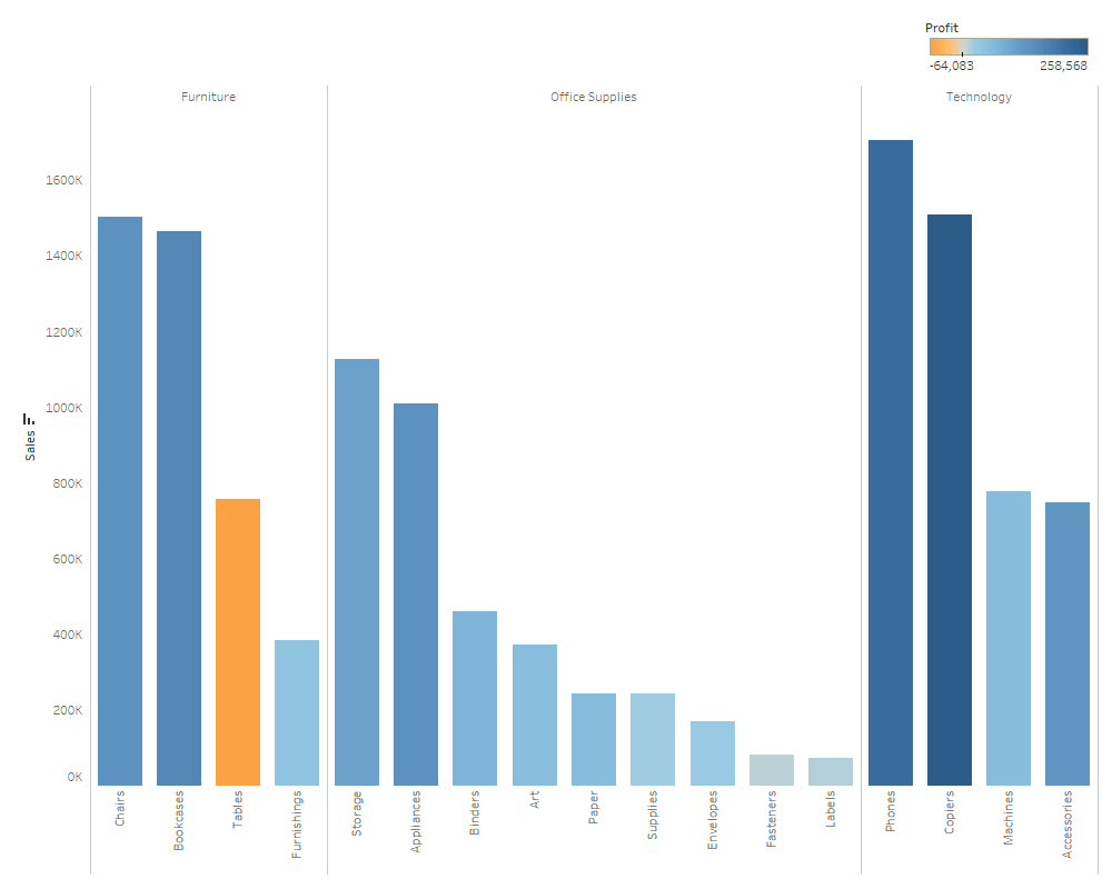
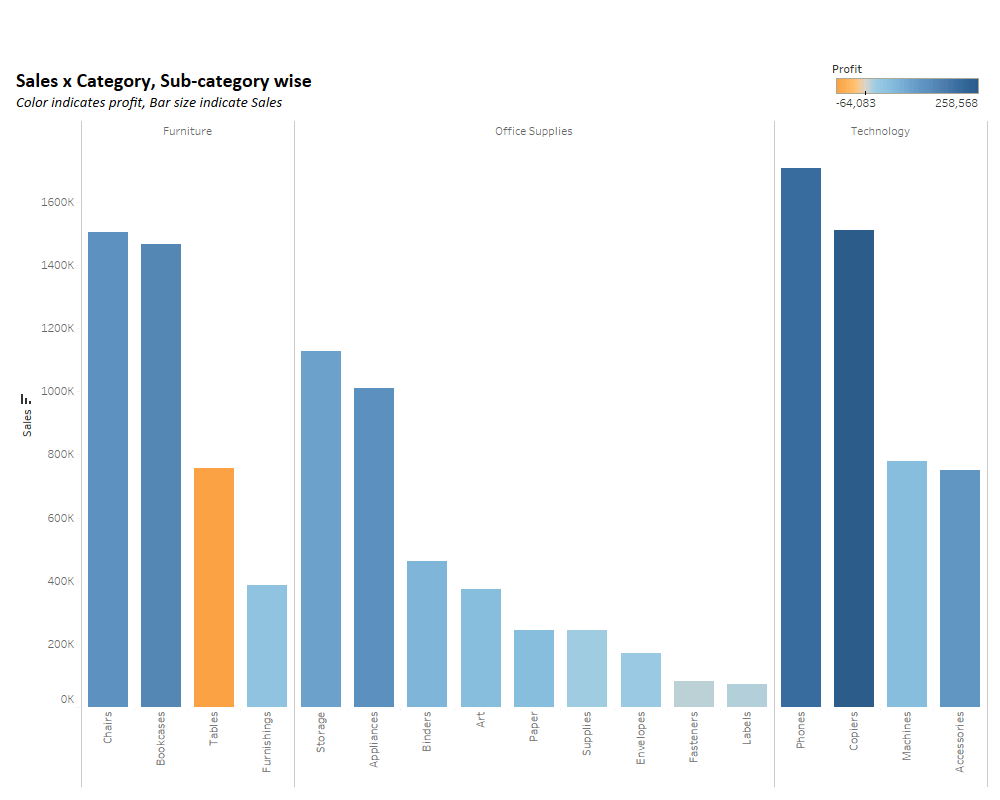
In the right chart view just by the addition of the descriptive ‘Color indicates profit, Bar size indicates Sales’ gives users a view of what holds in the view. On the contrary, the left view is very plain and it requires the user to decipher the information on things like what is what (although legend is displayed, still uneasy). Now let’s move one step ahead and talk about bubble chart display, the addition of descriptive like ‘’Bubble size indicates Profit, color indicates Sales” aids in giving clarity to end users then just displaying a bubble chart itself with no additives, as a developer our output should be celebrated on enablement of these dashboard readability and creating a rich experience for the user.
- Avoid Dashboard clutter
A generic saying ‘too many is not too good’ even holds true for dashboard design. The usage of the dashboard is to help businesses take advantage. The readability of the dashboard helps to bind the user experience. If we clutter the dashboard with loaded information and charts then it will lead to a complex experience setting for the user which is unwanted and uncalled for any business dashboard user. If this is a big ‘Yes’, below information would be helpful.
We often hear that all information metrics are important to the business and are required to fit them in a single dashboard view, which is ‘No’ (in case of ‘too much’ thing). An ideal approach is to identify the most important ones to be displayed and if required breakdown your views to create a new one, add filters. A good dashboard design should be limited to 4/5 chart views which could include key KPIs as well. As a developer, it’s important to bring forth such areas to your clients and ask them these questions, and propose best practices before just adding all chart views in one big box which hampers user experience.
The base idea of dashboard usability is to draw insights and allow users to leverage it in day-to-day operations. To cater to these requests in lieu of showing ‘ALL’ necessary information in one dashboard we may end up missing ‘ALL’ the information, so the key is to identify what is more important or relevant to be captured and displayed in a dashboard.
- Add Tooltips
In continuation to ‘dashboard clutter’ inputs, we may encounter such areas where a client says few metrics which are important to be displayed and to accommodate the same in views to display the information. One such way to add that is to add tooltips in your views which display information. Now you might say we already use tooltips in our dashboard view then what next to do? Our purpose here is to improve user readability experience so adding a tooltip is one part which most of us have been practicing now to add useful descriptive in tooltip is an art which helps charms your end user experience.
Let me explain with the help of a plain example. The chart view on the left displays info on tooltip like Sales value while the chart on the right adds descriptive information which is well deciphered by the end user and does context setting in building rich dashboard experience.
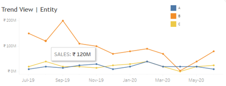
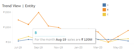
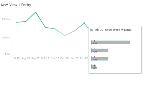
A bonus tip to share, to improve user readability experience add sheets to your tooltips which set a profound experience in terms of information display. Adding sheets on tooltips display is just another way to make room for a little ‘extra’ information which accelerates with your user requirement. In the below view we have added a sheet on tooltip which shows trend view month on month basis now on the tooltip we could display what are top products w.r.t sales value, VOILA! Capture your thoughts and present information interestingly.
In a nutshell, the key to an awesome and great Tableau dashboard metrics are clear. It really comes down to things discussed above: knowing your audience, thoughtful planning, aesthetic design, eliminating clutter, and a critical eye for refining your dashboard.
Watch this space for part 2 on our blog ‘Dashboard Design and User experience’ where we will share more inputs to amplify your user readability and design practices.
Keep Vizzing!


