

It is the 21st century. Sales decisions can no longer be based on guesswork. The future of sales is data-driven. Tableau empowers sales teams to increase revenue with AI-driven insights embedded in the sales workflow. Whether it is achieving sales targets or strengthening client relationships, Tableau helps sales teams spend more time selling and less time trying to interpret their business or customers. As the world’s #1 analytics tool, Tableau sales dashboard can help you understand more meaningful answers and turn your sales data into valuable insights. Tableau dashboard performance plays an important role in the process.
Understanding Tableau Sales Dashboards
Tableau sales dashboard present relevant sales data, allowing sales leaders to make data-driven decisions instantly. Having the right Tableau sales dashboards based on existing data helps sales representatives focus on which leads need contacting when, how close they are to realizing targets, what USPs to use in a call, and more.
In this article, we’ll share everything you need to know about sales Tableau metrics dashboards. We will also share some Tableau sales dashboards examples to help you get started on KPI Tableau performance dashboards.
But before we jump into the nitty gritty, let us take a quick look at the key features of Tableau sales dashboards!
Key Features of Tableau Sales Dashboards
- Tableau sales dashboard presents a quick, holistic view of sales deals and all sales-related data points.
- It contains the information sales representatives need to close their deals.
- Sales dashboards allow sellers to concentrate their time on selling rather than looking for the data required.
- Cleaning up sales data, analyzing it and exporting data from other sources gets automated.
- Sales analytics teams get a centralized, self-service BI dashboard—with reports as single sources of truth.
- Sales teams can be more agile and pivot quickly to hit quota more efficiently.
- Get more accurate sales forecasts, plan territories strategically, and have an exact picture of where you stand against your sales goals.
Using Tableau performance dashboard means that the sales department can make critical decisions with data, not just gut feelings. Sellers, sales leaders, managers and senior leaders can now get on the same page and work towards common sales KPIs.
Creating Tableau BI dashboard for Sales
To begin creating impactful sales dashboards, you need to consider the following key metrics:
- Know your agenda
What is your sales goal? Knowing your short and long-term targets allows you to focus on which sales KPIs you want to include.
- Sales KPIs to focus on in the dashboard
Design your dashboard to indicate select sales KPIs (e.g., quarterly and yearly forecast, quota results, growth, etc.) with the flexibility to add data points.
- Do not combine all sales metrics into one dashboard
That is a recipe for confusion. Make sure you have different BI dashboard views for clarity on different sales processes.
- Plan on dashboard updation and sharing
Since many sales teams or reps may require dashboards access, plan your data sources. Figure out how often the dashboard will be updated and how you would share the dashboard.
With a business intelligence platform like Tableau, creating sales reports becomes simpler. Tableau data visualisation features allow anyone in your organization to remain focused on the bigger picture and access key details on the ground at the same time.
Tableau Sales Dashboards Examples – Sales Dashboards Designed by Uneecops
Uneecops is a Tableau implementation and Tableau data visualisation partner. We can drive intelligence into the sales operations of your organization, managing the most complex business challenges. We can help achieve sales efficiency with the world’s # 1 analytics platform – ‘Tableau’. We also help fast-growing companies improve their Tableau dashboard performance.
Here are eight Tableau sales dashboards examples to focus your sales teams on boosting performance and facilitating decisions based on data. Use these templates as inspiration and places to start—and customize them according to your unique business needs.
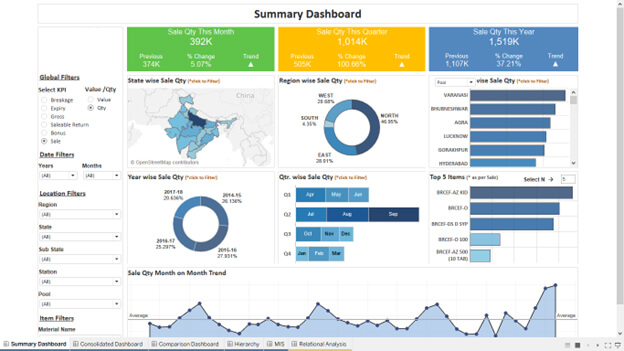
Summary Dashboard – This dashboard gives a 360* picture of state-wise sales quantity, region-wise sales quantity, year-wise sales quantity, top sold items and monthly sales trends. Use this dashboard to forecast sales performance and ascertain future goals.
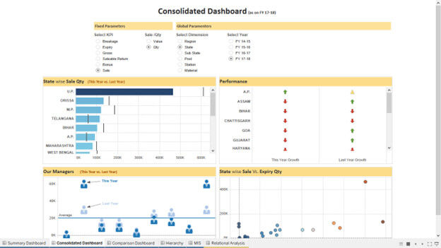
Consolidated Dashboard – Review consolidated data points to check yearly sales growth. Tap state-wise sale quantity and do a proper SWOT analysis (strengths, weaknesses, opportunities and threats).
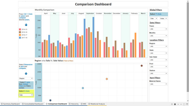
Comparison Dashboard- In one view, you’ll be able to have a holistic picture of monthly sales figures. You can compare and contrast region-wise sales vs sales value and apply filters to make varied comparisons. When presenting this information to sales leaders, you can feel confident in identifying reliable data.
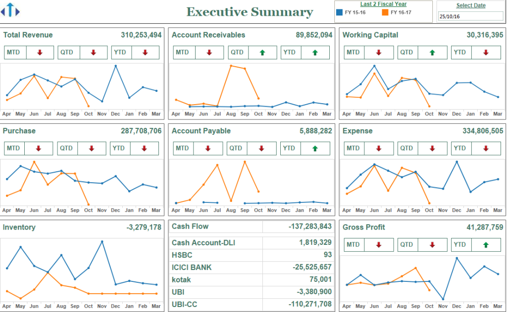
Executive Summary – This dashboard is designed for senior sales leaders to make decisions instantly based on current, factual data. You can have a consolidated view of total revenue, account receivable, purchase, inventory, account payable, working capital, expense, gross profit, cash flow, etc.
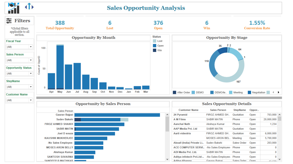
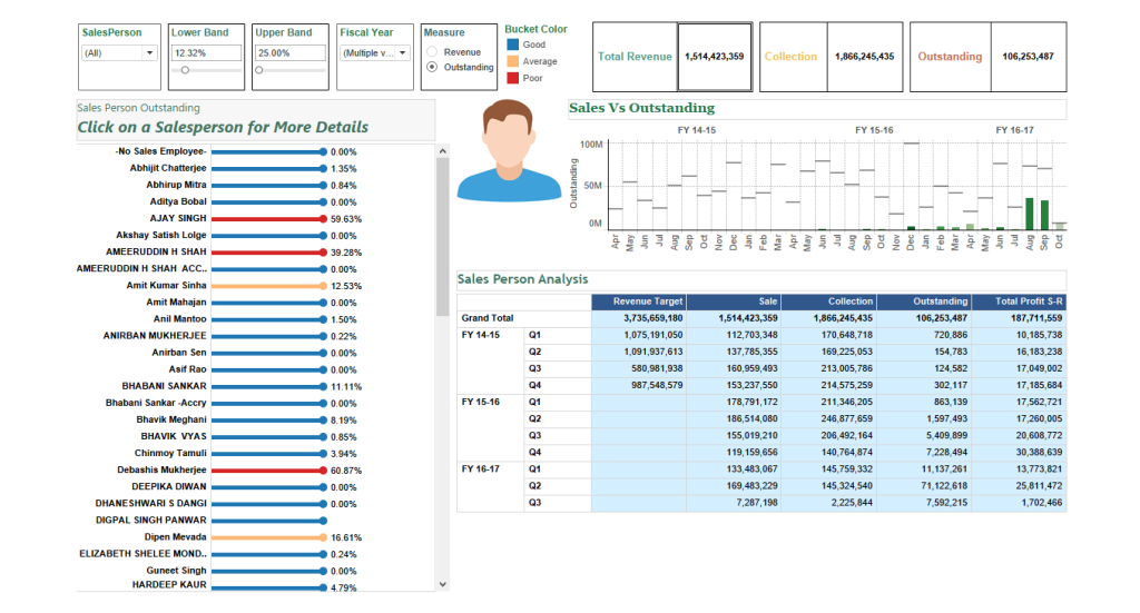
Sales Opportunity Analysis – With this dashboard, sales executives can track total opportunities (by month, by salesperson and by stage). You can view lost, open and win opportunities and track conversion rates. This also means you can spot opportunities that require you to pivot quickly, if necessary.
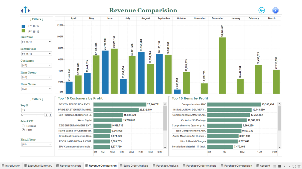
Revenue Comparison – Quickly understand how sales revenue is structured and how much revenue has been generated by a specific account. Compare monthly sales revenue and check top customers/items by profit.
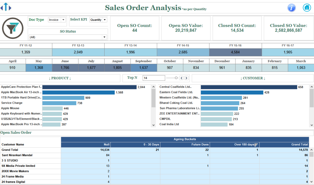
Sales Order Analysis – From open sales order count to closed sales order count and sales order value to closed sales order value – see a complete and accurate picture of the status of your sales orders.
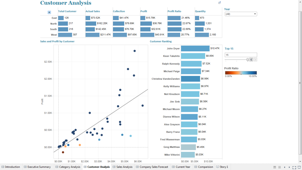
Sample Visualization (Sales/Customer Analysis) – Quickly filter your sales growth data by customer. Segregate actual sales, collection, profit, profit ratio and quantity figures by customer. These actionable insights can focus your team on customer success and reduce uncertainty in planning.
Along with sales dashboards, it is also important to learn how to build a Tableau dashboard, what does agg mean in Tableau, what is Tableau KPI dashboard and how to enhance Tableau dashboard performance. In this, the Tableau KPI dashboard plays a vital role. Let us understand this Tableau metrics dashboard in detail:
Tips to Create Impactful Sales Dashboards in 2025
To begin building smart sales pipeline dashboards and sales growth dashboards, you should know your target audience and KPIs. Remember to ask yourself:
- Who will view your audience viewing/interpreting these sales dashboards?
- Is it for stakeholders, sales or customer success managers?
- What KPIs matter most in sales summary dashboards? Is it deal closure rates, deal size, profitability or future sales forecasts?
- What will be the templates of sales dashboards?
- What data will I add onto my Sales summary dashboard? Is it updated and who will use/access this data?
After you know your audience, KPIs and templates of sales dashboards, keep these tips in mind:
- Keep the data up to date to track sales performance.
- Use detailed visual representation like bar graphs, charts to showcase data in sales pipeline dashboards and trends in sales growth dashboards.
- Sales summary dashboards help managers and leaders conduct a thorough SWOT analysis of target % achieved, funnel leakage, and other sales metrics and actions. So, when creating the sales summary dashboard, keep all information in one unified view, but avoid clutter.
- Dashboards should be accessible in real-time to enable sales teams to make strategic, data-driven decisions about sales goals.
- Dashboards should be shareable to improve sales team collaboration, data interpretation and drive future action.
Designing KPI in Tableau: Maximizing Impact with Big Numbers
The KPI Tableau dashboard has evolved into a pivotal tool for managerial assessment of business performance. This report provides a concise overview of key performance metrics, such as sales and profit, enabling quick insights into trends.
Effective communication is paramount in visual design, particularly in Tableau performance dashboard layout and formatting. Utilizing “big numbers” in the Tableau KPI dashboard emphasizes critical figures by enlarging their font, ensuring clear visibility. Typically positioned at the dashboard’s top, these numbers are accompanied by related details below. Moreover, color coding and directional arrows are often employed to indicate trends, enhancing the dashboard’s readability. As you discover how to build a KPI Tableau dashboard, here are the basic steps:
Creating a Sales KPI Worksheet and then KPI Dashboard –
- Create a new workbook titled “Sales KPI Dashboard” and connect to Sample Superstore.xls.
- Drag Orders to the KPI worksheet and format the workbook font to Tableau Book or Tableau Medium.
- Create a new KPI worksheet named “Tableau KPI Profit” and set up calculated fields for Current Year Indicator, Prior Year Indicator, Sales Current Year, Sales Last Year, Profit – CY, Profit – PY, Profit – Change $, and Profit – Change %.
- Format the Profit – Change % with custom formatting for up and down arrows.
- Design the Tableau KPI Profit worksheet layout with Profit CY in rows and Profit – Change % in text, colored with an orange-blue diverging color scheme.
- Duplicate the Profit-related fields for Sales and create a new worksheet named “KPI Sales” with a similar layout and formatting as the Profit worksheet.
- Create a new field for Profit Ratio – CY, Profit Ratio – PY, and Profit Ratio Change.
- Duplicate the KPI Profit worksheet and rename it to “KPI Profit Ratio,” replacing Profit – CY with Profit Ratio – CY and adjusting formatting for Profit Ratio Change.
- Build the Tableau KPI dashboard by dragging KPI Sales, KPI Profit, and KPI Profit Ratio into a horizontal layout container, ensuring even distribution.
- Remove color legends from the dashboard to streamline the layout.
Sell Smarter, Faster and Better with Tableau Performance Dashboards. Achieve it with Uneecops!
As a strategic partner of choice, UBS helps you create insightful, easy-to-use, and intuitive dashboards tailored to your sales environment. Our data analysts and Tableau data visualisation team help you to collaborate easily and stay abreast with sales workflows – anytime and anywhere.
From mapping KPI in Tableau to ascertaining Tableau dashboard performance, we enable businesses with Tableau implementation and managed services.
Get ready to create compelling Tableau Sales Dashboards and:
- Close deals quickly and drive more sales revenue with analytics
- Automate sales processes from lead to cash
- Spot more sales opportunities everywhere across your organisation
- Help your sales teams sell more and work together
Last but not least, get ready to achieve sales success!